
ROLL:
UI/UX Designer for Travel App interface.
www.mtt.ie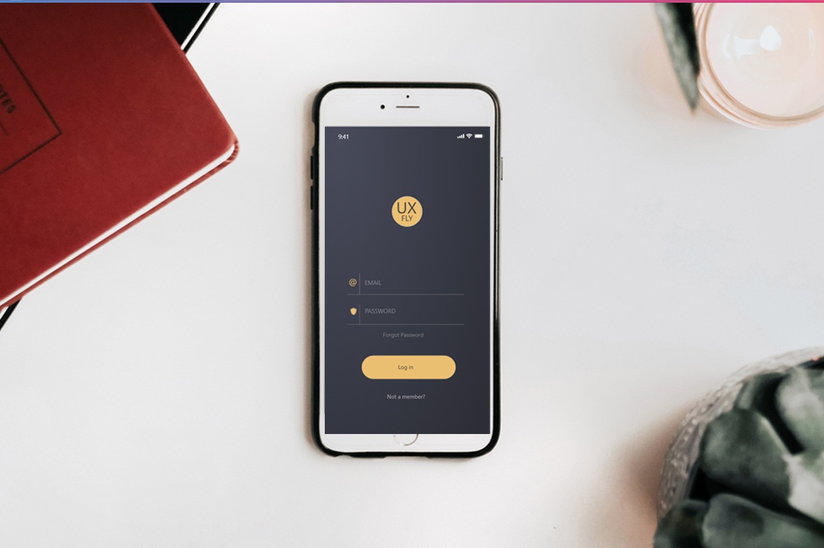
Creating a working mobile app prototype for the Travel industry, Redesigning and updating MTT to become more friendly and an aesthetically pleasing UI.
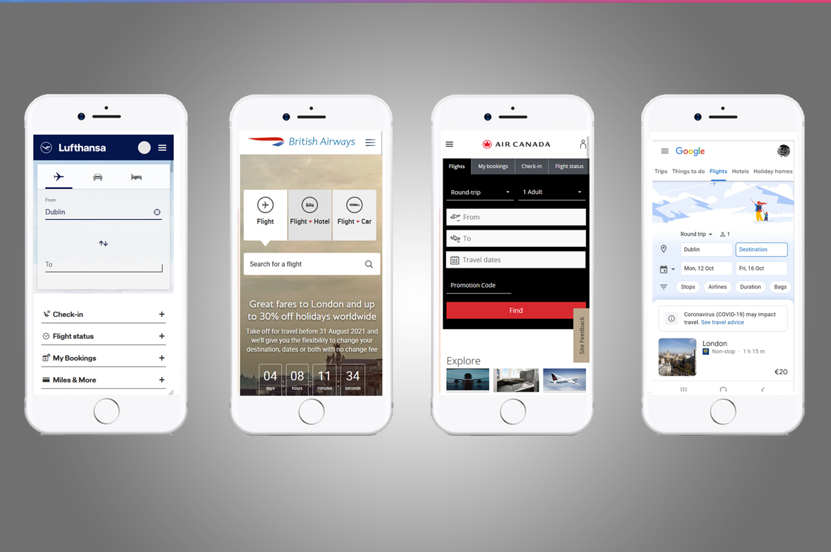
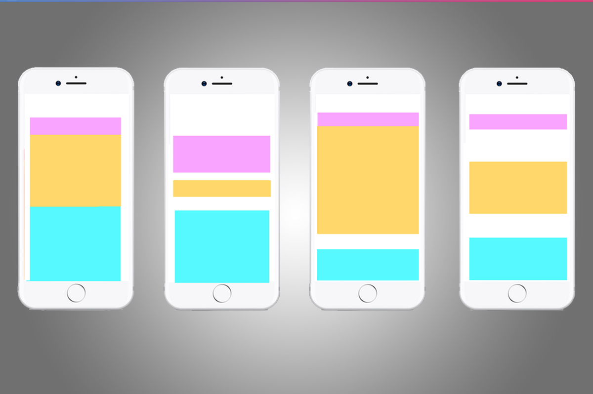
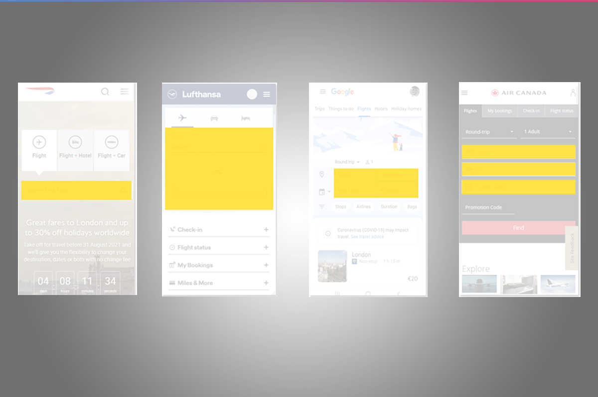
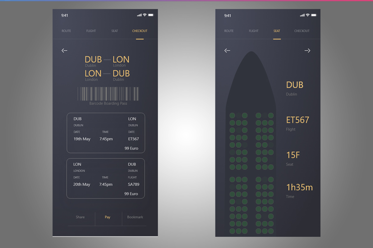
I created several versions of benchmarking competitors. To test both visibility and usability. Examining landing page's of competitors is an extremely useful research technique. I started designing the homepage and landing page in Figma.
My approach: Identify what your competitors are doing right. The human brain is great at identifying patterns. I decided to design my hierarchy around patterns and implemented a new expandable drop down menu, which allows you to make multiple selections.
This allows users to search for their desired destinations/ports more easily and look at different destinations as opposed to the original. I had also added scrolling cards for cruise line deals to improve visibility and make it is easier for users to see the deals efficiently without cluttering the page.
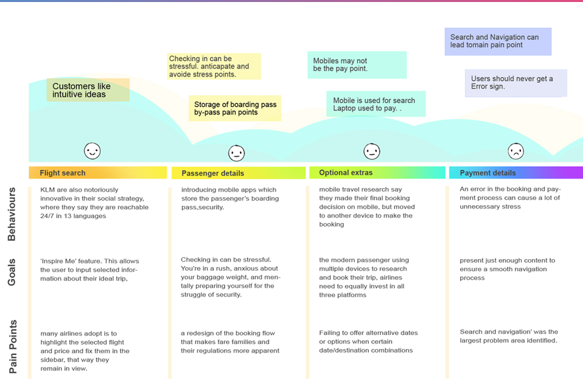
Users were frustrated by the previous UI. They could not find what they were looking for with the current navigation. They would often give up using MTT on mobile devices because the navigation was clunky and unresponsive Only a few of the MTT pages were responsive.
Our user testing demonstrated customers were having trouble finding important pages on the portal. I suggested we implement search functionality as part of a 5 point plan to help them find items. Here I created mock-ups to show managers the flow diagram.
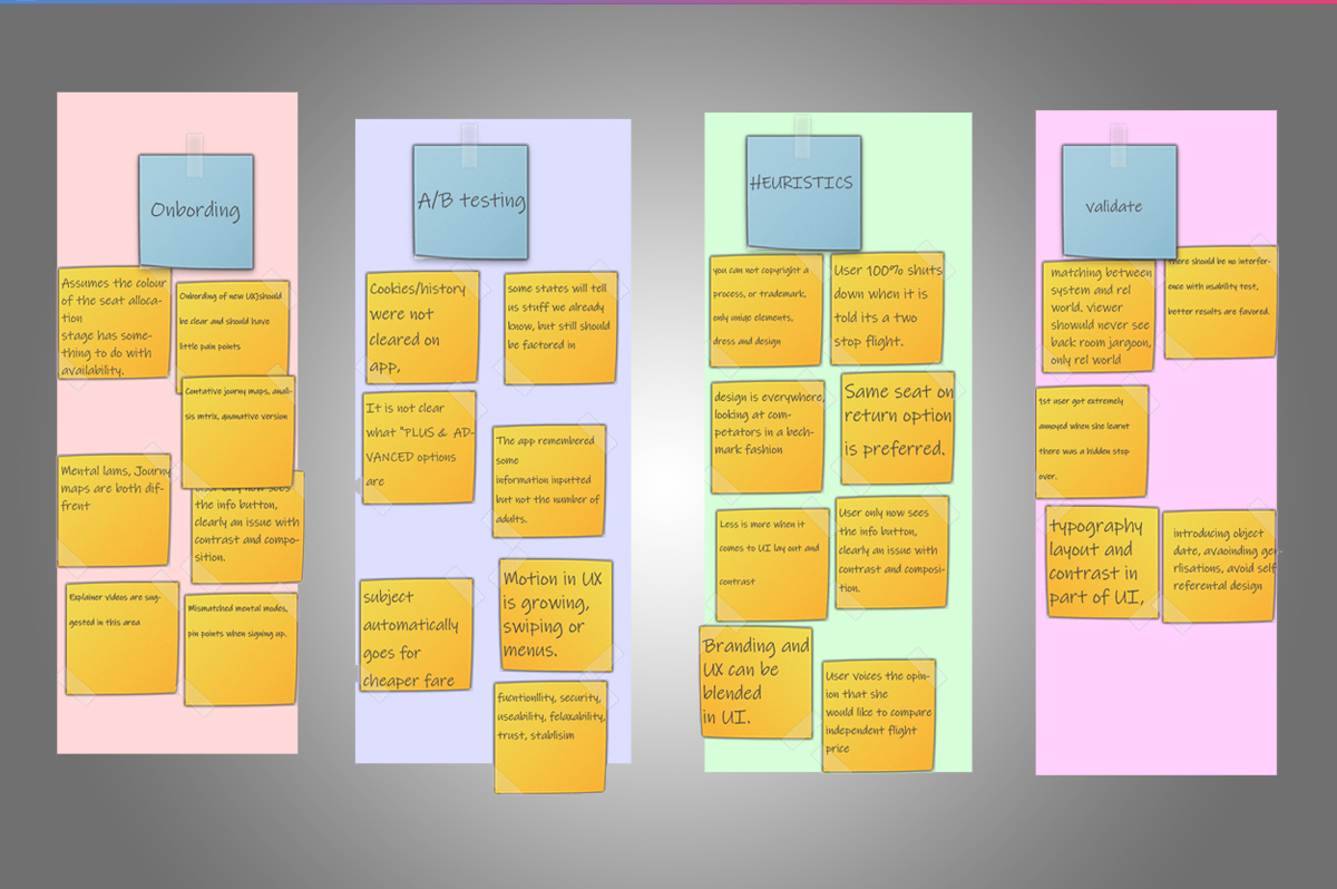
I conducted user testing of customers to understand how they were currently using the portal and to assess any pain points. I encouraged staff at MTT to sit in on the user testing and conducted requirements workshops to see what they noticed.
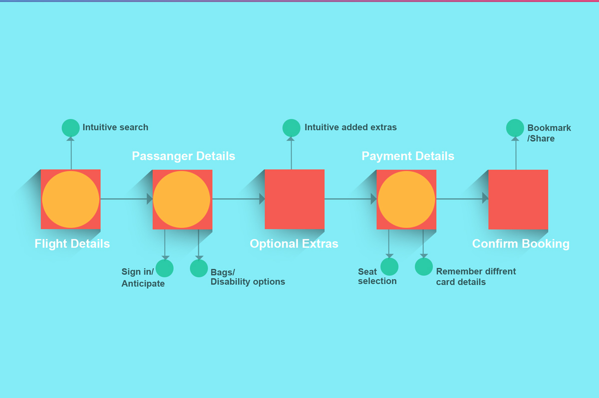
I created User flow maps based on our user research to help communicate the client journey and to communicate the content they would be needing at each stage for the Programmers.
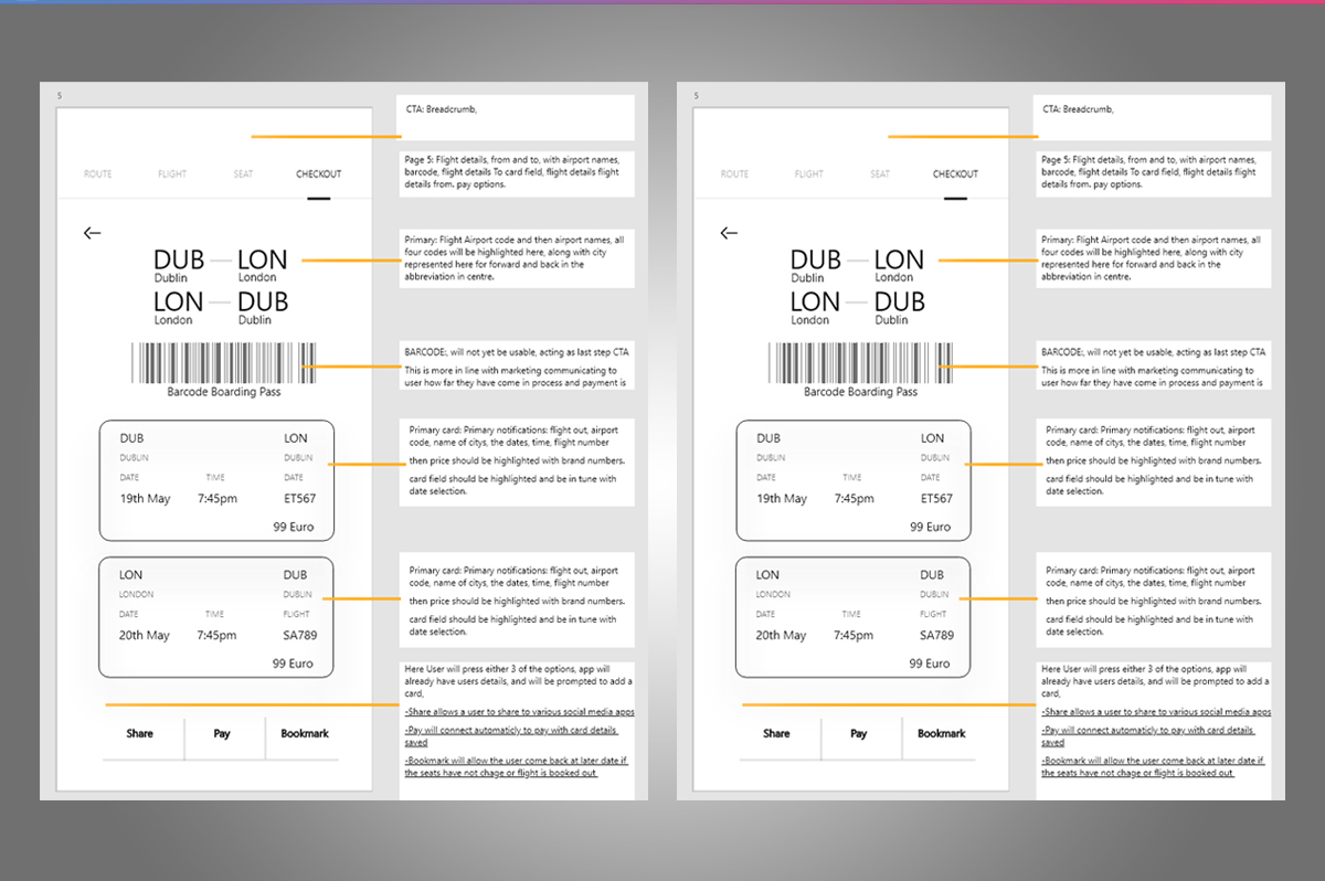
I established the first MTT app style guide and redesigned the UI elements for improved accessibility and mobile usage. I also introduced new UI elements that the team clearly had a need for. The style guide is based on a VIP section.
If something changes in the style guide, it changes in live, to ensure consistency across MTT. The style guide is also helping future MTT Partners understand the MTT style when previously no guidelines were in place. And faster design and prototyping, helping everyone from developers to non-technical staff.