
ROLL:
UX Designer for Interactive screens in Gym's
www.kitsune.ie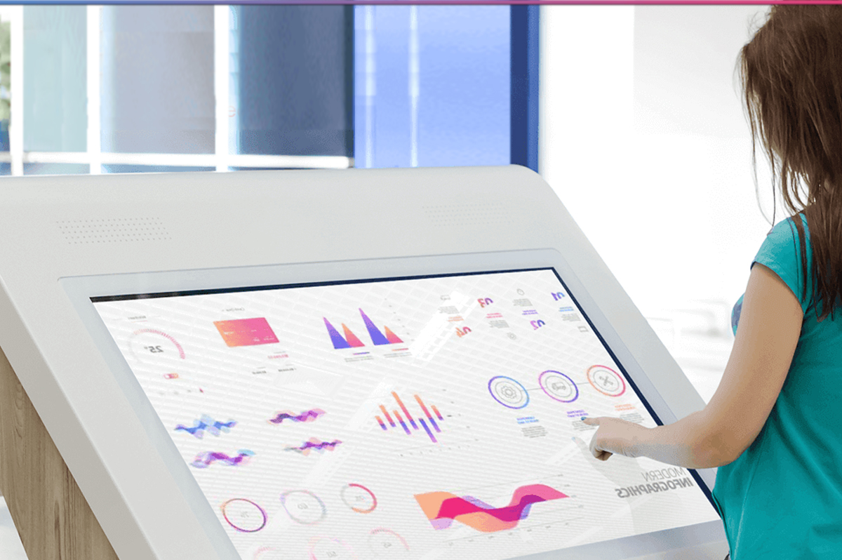
Design/New Media class's. Where we explored different ways to increase excitement for Kitsune members increasing their Gym experiences regarding routine.
We introduced the UI in order to provide a central place for a user to go from when starting their Kitsune journey. Users have the option to record a Session stats. There is also a short video that explains how the whole process works, again to reinforce the information we are trying to convey.
We decided to introduce fun and friendly illustrations that would support the questions. We chose Motion design over live action because they are timeless and reflect emotional sentimentality of the product that are often not as deliberate and certain as a Video.
I decided on the iconography and rule of thirds concept. Giving users the ability to start/pause/save their session. A power that wasn’t given to them in the previous prototype. By doing this, we have removed the uncertainty of knowing when the session would begin and end.
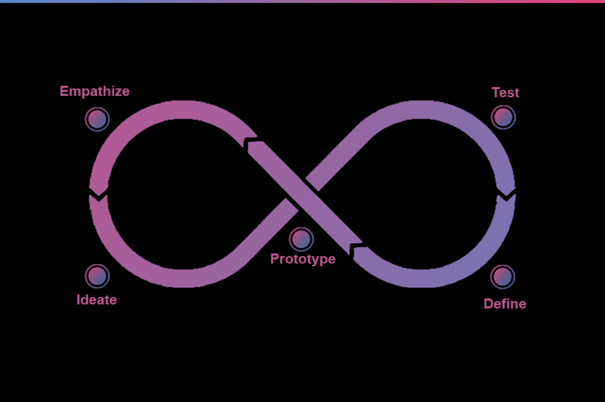
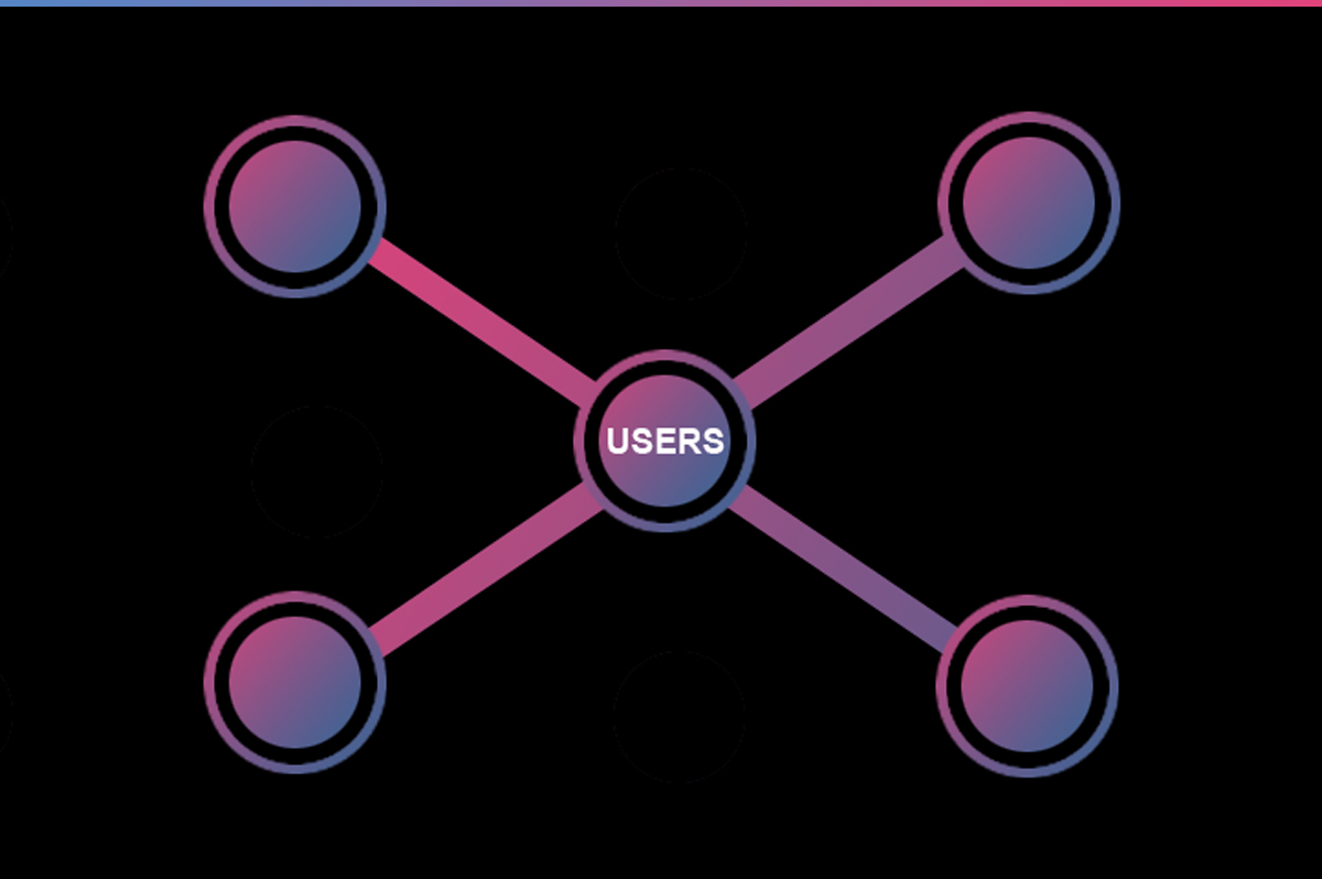
The first thing we focused on was our research strategy & pattern design. We conducted a usability test by interviewing people that fit our user archetype. Users over the age of 25 who had lost weight 3–5 years. Before we began our interviews, we first needed to do two things. This enabled us to conduct our interviews in a consistent and controlled manner.
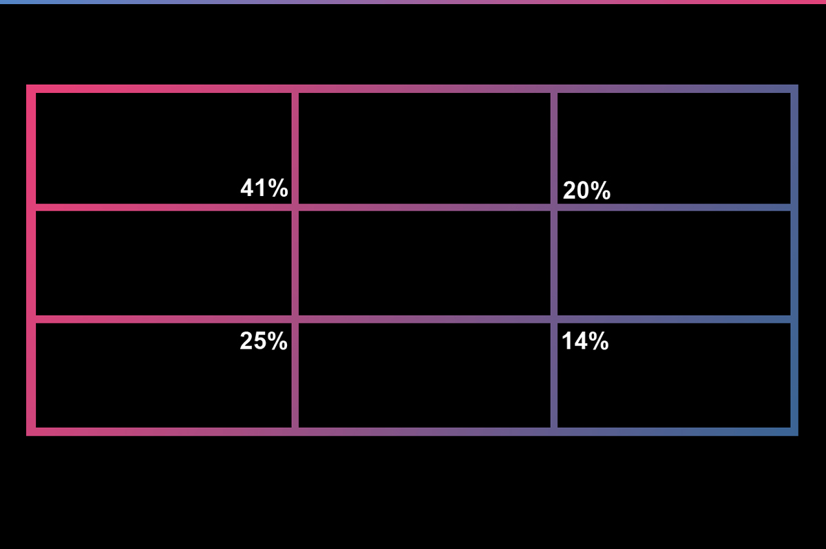
As part of our Competitor Analysis, we conducted an analysis on three apps with similar product offerings to Kitsune. These were: Toughness, Speed, Reward. We focused our research on User Interface elements and User Experience Flows – including the Sign-in process, UI stage and the Features.
Later, we conduct a competitor analysis. This gave us an insight in the market space and provided additional context for the problem we are working on. After our analysis, we grouped and calorized the data into an Affinity Map which enabled us to have a clearer understanding of the user experience.
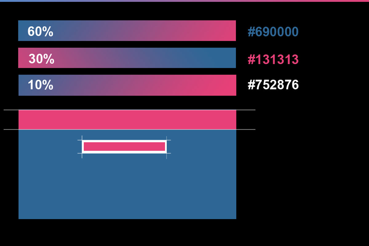
I decided on a mix between blue and purple for the UI. Blue is often seen in nature as the sky or the ocean, but it is also a colour of trust, which is why it is popularly used by banks and healthcare providers. It’s important that Apps like these convey a sense of calm and is emotionally welcoming, otherwise, users might feel an unease and could quickly turn away from the experience in a gym setting.