PAGE UNDER CONSTRUCTION
Unrelated links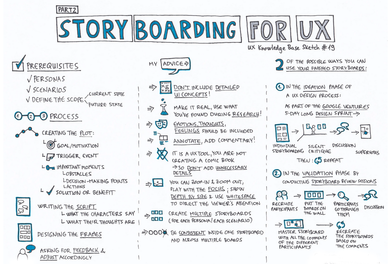
USEABILTY TESTING
Who are our users and what are they trying to do?”
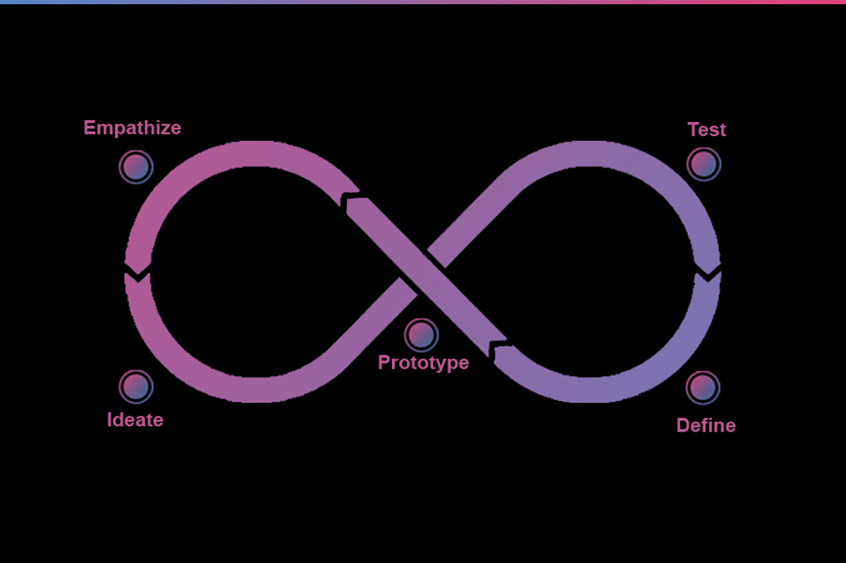
The first step of any research endeavor should be the development of a research question that will provide the central core around which an investigation, its methodology and its data analysis, can be developed.
your question list may well ask a respondent, “Do you like coffee?” or “How many cups of coffee do you drink in a day?” or “What’s your favorite brand of coffee?” but your underlying research question is, “Does drinking coffee affect employee productivity?” it is the question—not the answer—that is the most important part of research.
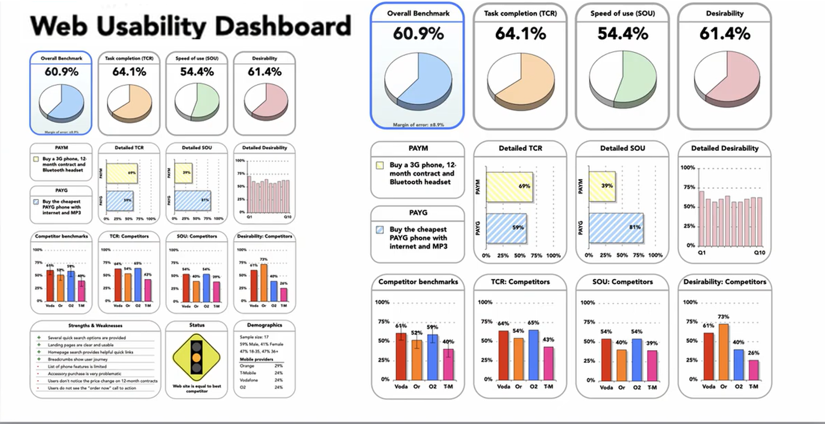
Usabilty benchmarking:
You build a dashboard of visual elemnts repusenting quantitative and qualitative
Usability benchmarking takes a collection of related workflows, breaks them down into discrete tasks, and measures how usable they are across several dimensions. What this generates is a rich body of quantitative and qualitative data that highlights specific pain points and areas for improvement.
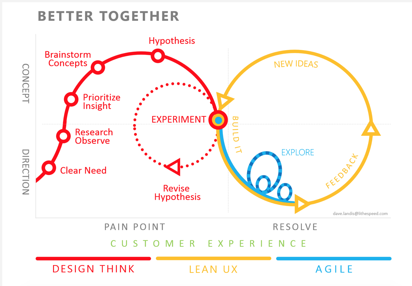
UX Notes
UX refrences
inline validation, example if the email is wrong. research, design, build, test visian must be clear on what goal is, high fidelity product, process has to have a natural structure, numbers, percentages, graphs, measurable data hard science, surveys, ab testing, analytics, structured, measurable data., observable, eye tracking, usability testing, feld studies quantitative, corad sourcing, online surveys, customer feedback, message board, qualitative, interviews, focus groups,
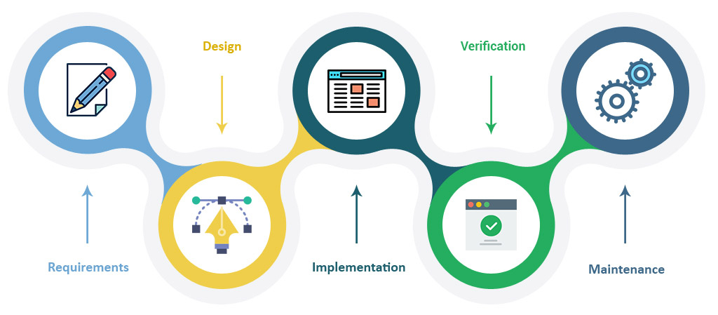
UX Notes
UX refrences
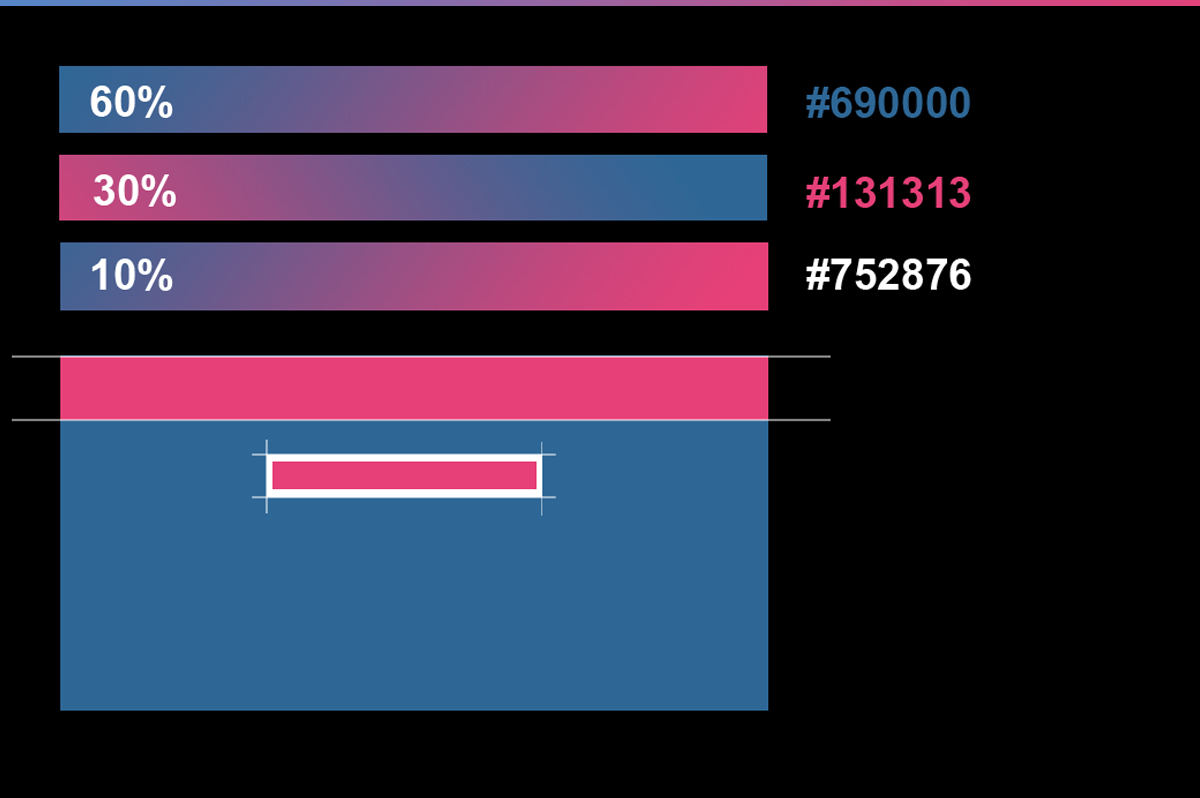
We decided on the iconography and rule of thirds concept. Giving users the ability to start/pause/save their session. A power that wasn’t given to them in the previous prototype. By doing this we have removed the uncertainty of knowing when the session would begin and end.
UX Notes
UX refrences
The first thing we focused on was our research strategy & pattern design. We conducted a usability test by interviewing people that fit our user archetype. Users over the age of 25 who had lost weight 3-5 years. Before we began our interviews we first needed to do two things. This enabled us to conduct our interviews in a consistent and controlled manner.
REGISTRATION
UX refrences
Bad registration is why most people will delete apps dont force, explain why dont use social media users want to check that you want to give them something some apps need to reg people early people today dont want big social media company's knowing more about themp>
COMPLEX FORM
UX refrences
structures like a conversation keep to best practices minimize best inputs use smart defaults choose a flow style
UX Notes
UX refrences
top align labels Single columns,field length as important, use descriptive labels, interactive walkthroughs are better than stats interaction is good, motion is better, avoid extensive tutor overlays, users want to try the Service, contextual hints, all ways be up front you need to show what the user wants too know, animated walkthroughs are best explaining an apps features fast
PROGRESS BARS
UX refrences
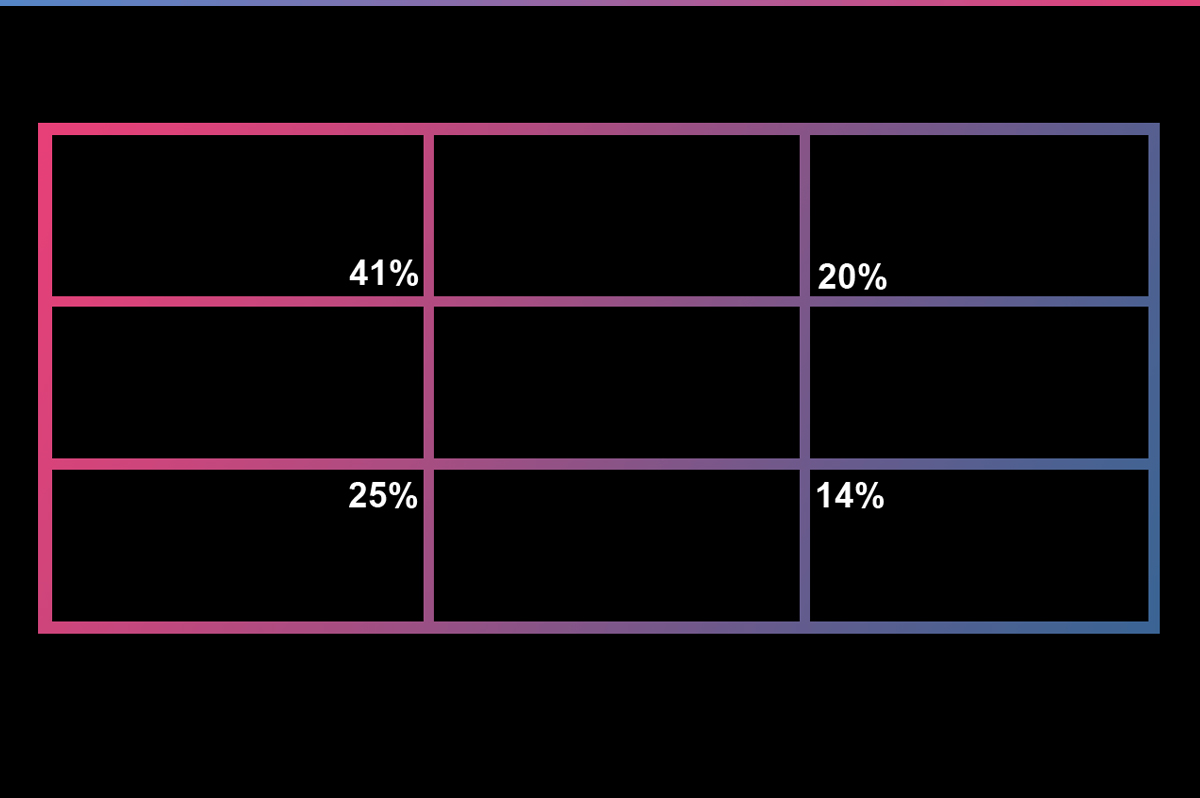
payment which is king, make this no one, no barriers 80% of mobile users abandon the app.. use auto formatting, fill fields increase perception of security, , follow conventional flows, breakdown what is happening, always make info visible, do not scare users in payment stage, as in who am i paying
MOBILE NAVIGATION
UX refrences
smoother flow than desktop people dont care about your app. navigation patterns content needs to act as navigation, blended smart navigation, example finding country of residence, ireland iran iraq, priorities content over navigation. benefits of good ux, increasing revenue, reduce production costs, increase customer acquisitions, increase conversations, increase customer satisfaction and retention, reduce customer learning, main goal, patterns, research, design, build, testvisian must be clear on what goal is, high fidelity product, process has to have a natural structure ideas can be
UX Notes
UX refrences
more features complicates things, each feature makes other less memorable more for user to remember tv remote controls are a good example what is the tradeoff good ux is what it feels like to use a product, system or service functional design, drive of car, aesthetic design, look of car, experience design, inside of car great products solove user problems and generate positive emotions, fundamental tasks, navigation. negative emotions have a multiplier effect product integrity represents the product for the user where is it more important, more product features, making it less complicated more streamlines affect viability, the business feasibility, technoilgydesirabilty, customer what is the user goal, what is their end goal.
Quantitative data research,
UX refrences
your assumptions vrs real world. form questions, gather data, analyze data. qualitiveunstructered, usability, test, open end questions, focus groups, not all info that can be measured, deep insights, subjective, smaller sample sizes, not a science, usability testing, using camtasia software. records the screen. user testing, looking over their shoulder. task objectives, testing different from functions, moderating viability testing, know your questions, dont stray, or help avoid yes and no questions, avoid open ended questions. avoid hypothetical questions, avoid design questions.
ENVY
UX refrences
creating desirability, identity, the stape of print design, the design feel must resonate with product, resonate with target audience, functionality, identity and then solve a problem that no one else has solved creating a set of rationalized trap, start a discussion of relative value per dollar over apple users andpc, a good way why people will go with one and another establish a manufactured source of credibility, apple store, symbolism, belonging, welcome home greeting use self generated presentation of product construct vivid applies, new products demonstrate on stage key components- apple marketing often offer competitor offerings, , performance comparisons, of the ame product apple statement apple products are not cheap, choose too use, think differently apple say competitively and confidently competitors just just get it happiness does not trigger commerce, unhappiness dode
UX Notes
Brain storming
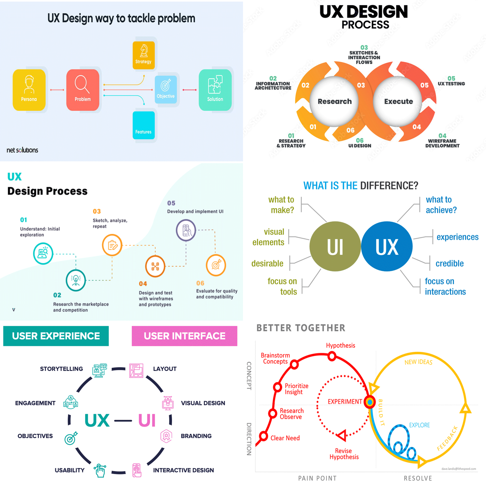
Later we conduct a competitor analysis. Small groups of smart people, Spectator are not welcome, low fidelity design, reduces ambiguity, time and space to validate, reduces risk. failure to prioratisepriortising design for the most common case, the what if scenario. progress disclosure, giving people info when they need it, not all at once, the paradox of specificity designing for a more specific product, products that do one thing good might be better than products that do many things.
